Gill Moon Photography Website Design Woodbridge
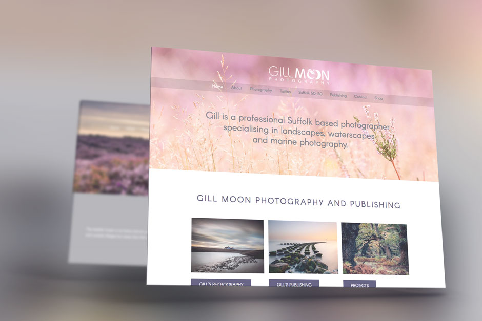
This is a great example of a website design that needed to allow the images to present themselves. By that, I mean enhance the experience while letting the beautiful images take the spotlight.
Unlike some messy photography websites where the design obscures or detracts from the one thing visitors are there for this design lets the images light up the page, Gill is a fantastically talented photographer, it truly shows in the website and made our job as designers a delight.

Each page can be customised with it’s own hero image and matching colour box for the introduction text. With each page showing yet another amazing image from Gill’s collection it was a delight to design and will be a true delight for any user to browse through the website.
After studying Gill’s images and looking at her unique style we selected some soft colours to use for her branding and created set areas where text could be added to complimentary coloured blocks.
Keeping the logo in a single colour, white, it doesn’t distract from the powerful images. We also had to carefully select the shade behind the tab links to balance it just right with varying images.
Setting up WooCommerce and a shop page to display all of the stunning photographic products Gill sells.
The generous use of white space allows the imagery to shine through and showcases Gill’s work on every page.
Gill also runs Landscape Photography Tuition courses, Gill asked that we create a sister website to accompany the main Gill Moon website to take focus on to the tuition.
We also designed Gill’s logo design.

We love working with photographers as their images help to make the website what it is. If you are a photographer looking to showcase your portfolio or products in a website that is designed to show your work at its best, please do not hesitate to get in touch.