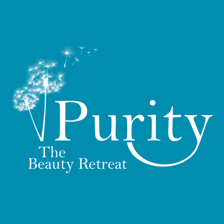
Purity Beauty Ipswich Logo Design
Here we have the Purity Beauty Ipswich logo design. A logo design and branding created for a high quality beauty retreat based in Ipswich, Suffolk. The main aim of the logo graphic is to look natural, gentle and delicate. This three things represent many of Purity’s services. We used a classic looking serif font. We didn’t want to go overly modern but added a customised tail to the ‘y’ creating a satisfied smile or a gentle hug. This made the logo completely bespoke. At Purity you are their priority.
The logo and branding have been used throughout the salon and on any literature created for Purity Beauty Ipswich. The client had already made a decision on the colour for this design. We took that on board but we had to choose a complimentary colour, grey. We also had to take into consideration that it worked both reversed out and on a coloured background. Please do take a look at their website to see how the branding works over there.
