Pascoe Barton Brand Design Felixstowe
Pascoe Barton’s brand design was a combination of a fantastic, interesting brief and a fairly free reign on the creativity of the logo design. The brief was not your usual brief, it followed more of a family history as opposed to the character of the business but it was requested that it still needed to represent the business without being obviously about the history.
The history behind the business name ‘Pascoe Barton’ comes from the search for 106 Squadron’s Lancaster bomber ZN PD214. Unfortunately on the crews 30th and final mission it left it’s base at RAF Metheringham, near Lincoln in Lincolnshire to take part on a raid on Bremen on 6th October 1944 but it crashed during the mission. Only two bodies were found by the German Army. The body of our clients Grandfather, Flight Engineer Sgt Ronald Pascoe Barton, was never found.
With this history briefed in it was the link between the name but the business had very little to do with flight as the business concentrates more on the shipping industries. As always we love a challenge to get as many messages across as possible, with one being a subtle wing shape in the logo graphic.


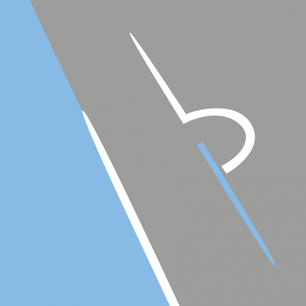
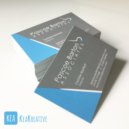
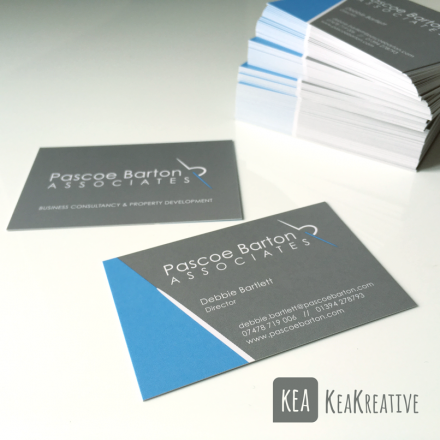
The design itself has been created to show the business initials of the P and the B – imagine lowercase p and b, there you go, but there is more to it than that now look at the pb graphic and imagine looking down a wing towards the engine, do you see it? Ok if not try to imagine looking at a propellor on a plane as that works too. But from that visual we have also tried to carry more of a water/dock feel with the large area of blue for water and grey as land/tarmac. It is also an angular structured design which is another character of this business, structure and organisation.