Fencing Logo Design
Hardman and Oakley are currently a team of two guys who approached KeaKreative to produce a website for them. They had a logo design for their fencing business but we decided to tidy it up and produce a new design to keep it inline with their new website. We were not asked to produce a logo as the client was happy to use their current design but we felt it did not suit the website style so being a cheeky designer decided to create a new fencing logo design for them.
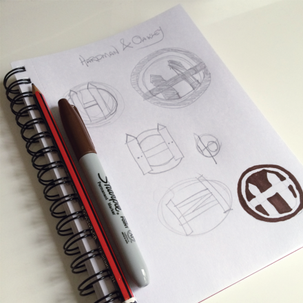
Hardman and Oakley are the business, this is the surnames of the two business partners. We decided to try and incorporate their initials into the design but also incorporate a fence a few doodles later we produced exactly what we had in mind. It’s not often that we come up with logo ideas that are just right but from this one page of doodles we knew this was the design. It’s strong, structured, incorporates an ‘H’ and ‘O’, a picket fence and is simple. It can be used as an icon too.

